Evergreen Organics
Food and Beverage
2020
Evergreen Organics. Evergreen. EG. Organics. It doesn't matter what you call them; they are Qatar’s first and only wholly plant-based café. Our journey with Evergreen Organics can be traced back to 2015 when we were engaged to consult on their brand identity before their restaurant launch. The founders were working with multiple designers, contractors, and consultants and couldn't find clarity amongst the noise.
Their envisioned brand was not coming to life, and time was ticking. They didn't have time to re-brand and instead decided to roll out their logo without a fully developed brand in place. Although we did not work with them on their initial logo, we later advised and helped the team with the development of paper applications for their involvement in the Qatar International Food Festival in 2016. In 2019 we re-branded Evergreen.
Client:
Ghanim Al Sulaiti and Jawaher Alfardan
Services:
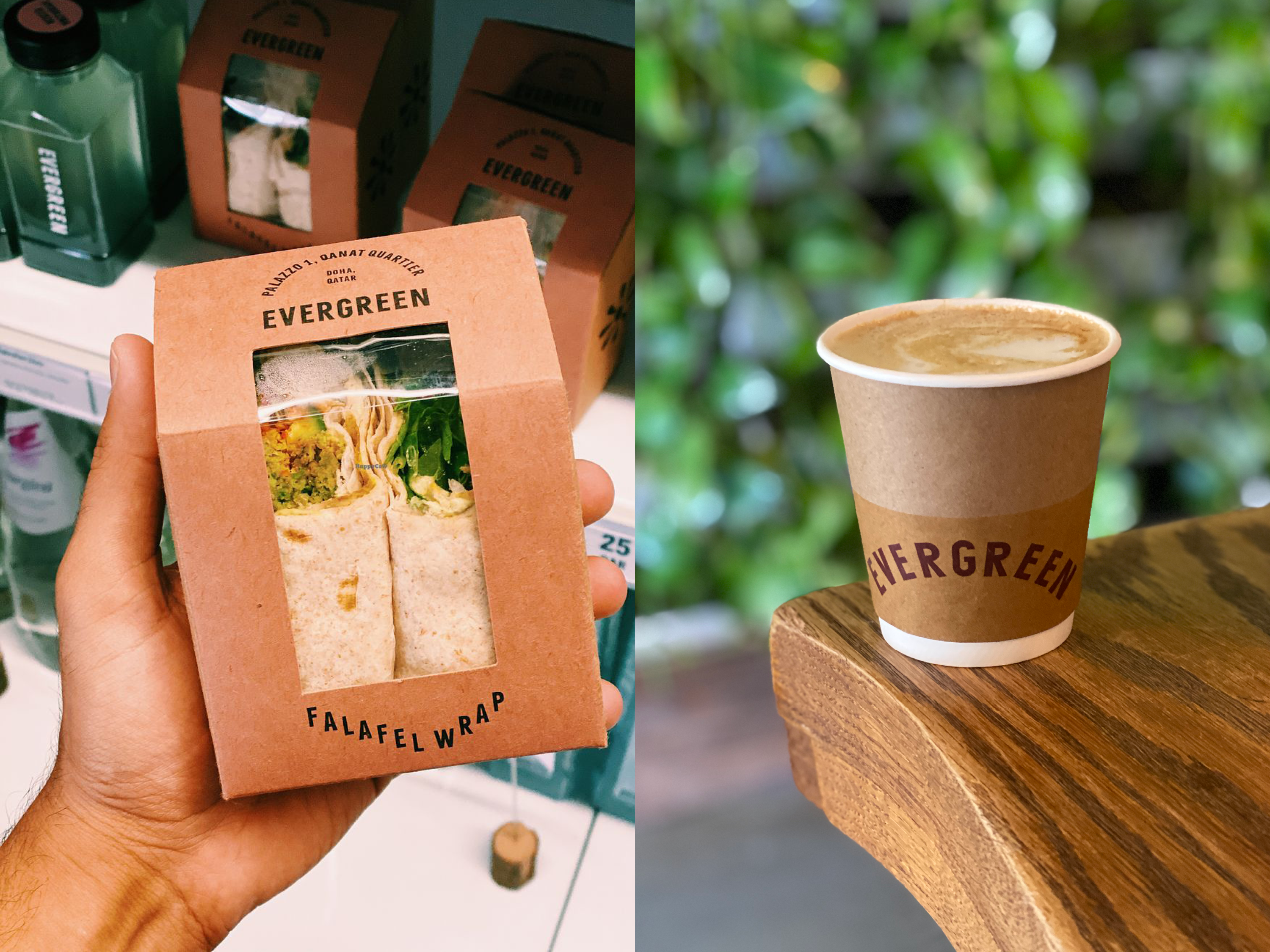
Creative Direction, Re-Brand, Brand Strategy, Copywriting, and Packaging.
Credits:
Brand Identity and Typeface: Kobra
Image credits:
Public Domain/Fair Use
It was not until 2019 that we were commissioned to re-brand Evergreen. When Evergreen first opened in 2016, they were the first fully vegan restaurant; however, over the years, as more concepts started to launch; thus Evergreen needed to re-think its offering. After our successful work with their sister brand Green and Go, the founders asked that we work with them to re-develop, re-brand, and re-strategise their offering within the market.
We, alongside a selected design team, worked with Evergreen to change their logo, develop a custom typeface, introduce brand elements (for the first time) and develop their colour palette. We needed to be aware of the equity the current brand had, and therefore, the changes we implemented were not meant to disrupt but rather complement the offering. We started with a creative workshop whereby we analysed the Evergreen brand and understood the vision moving forward. We listened to the business’s pain points and sought ways to provide solutions to current and foreseen problems.
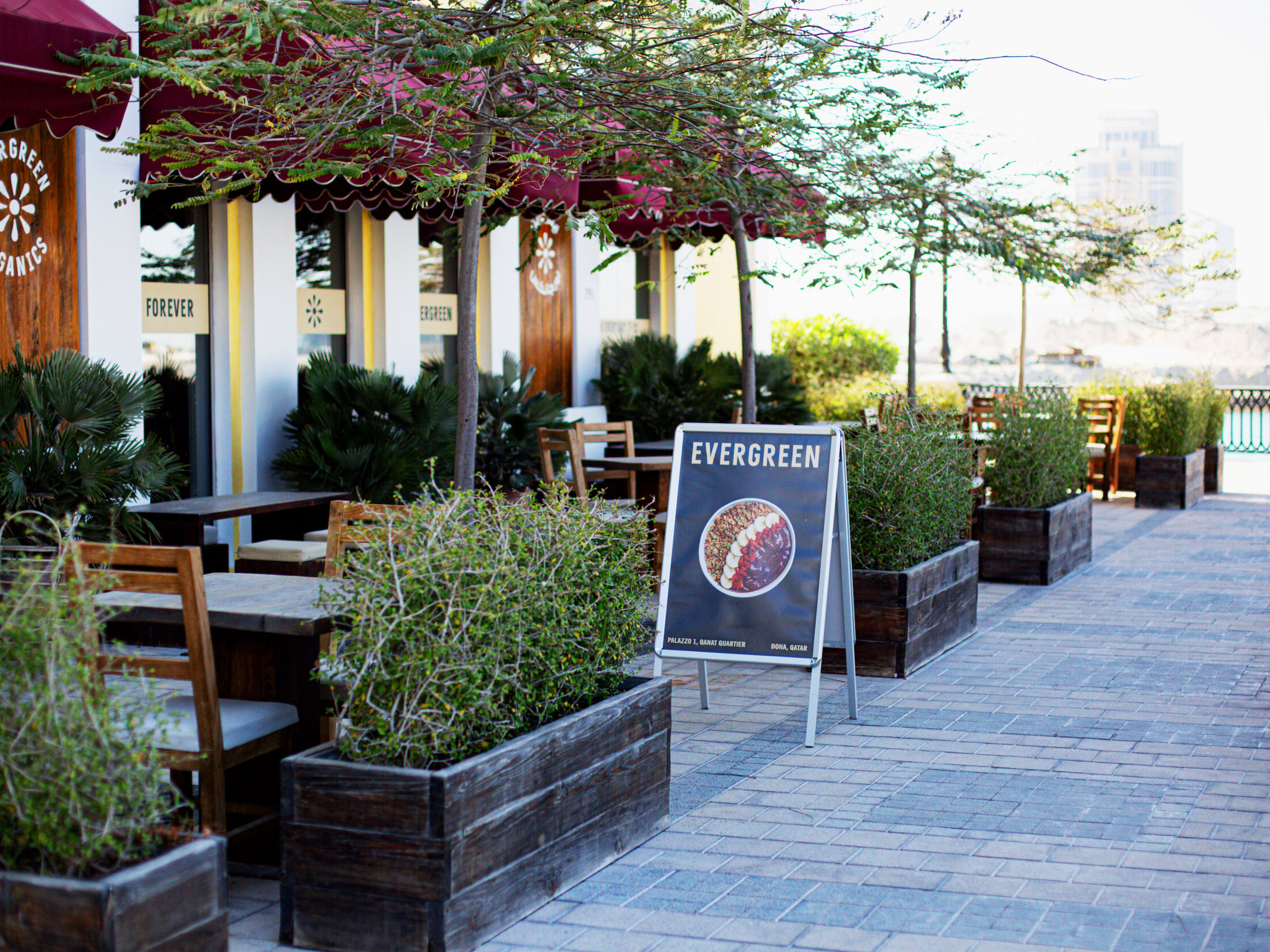
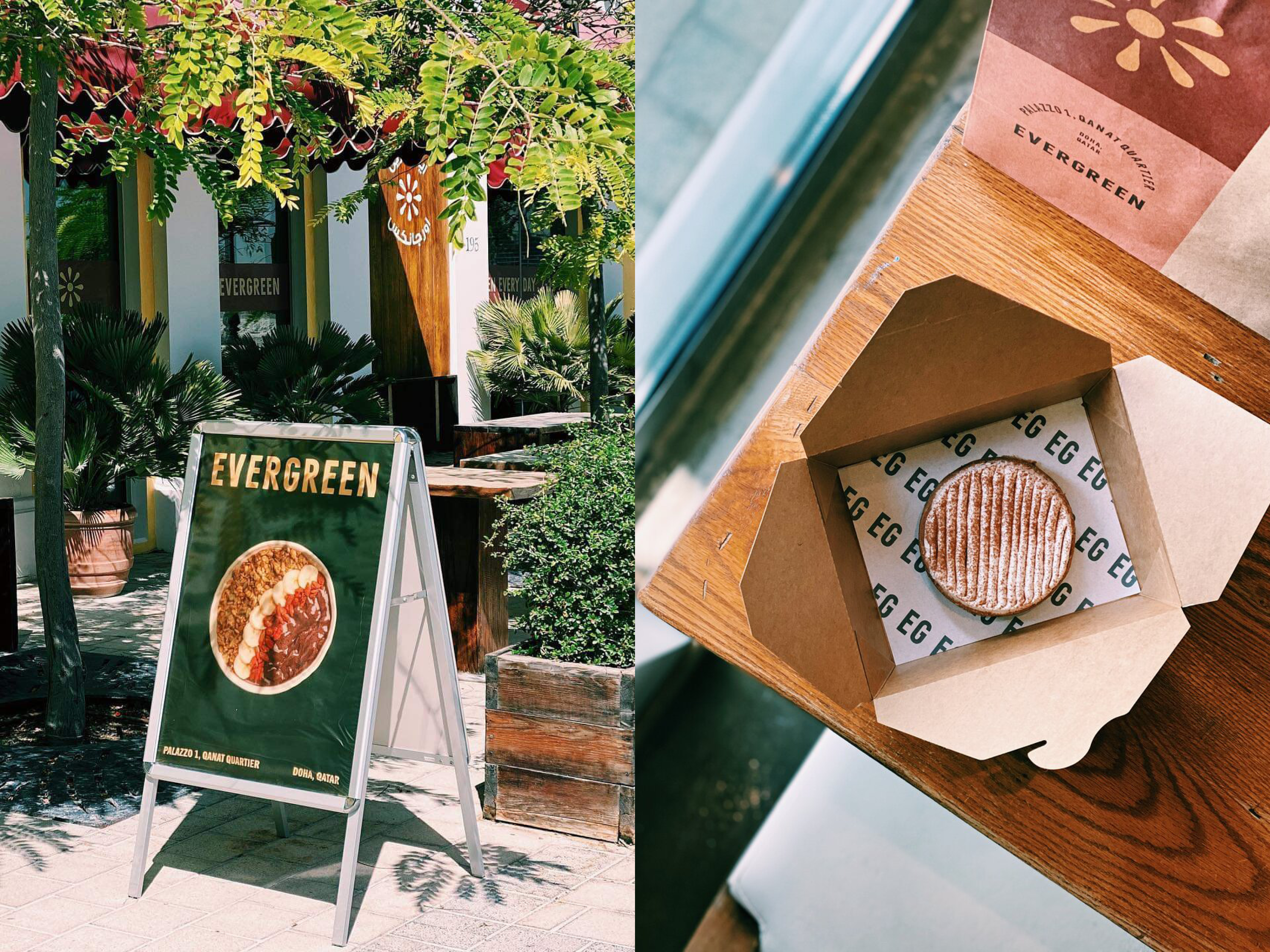
The new identity for Evergreen took inspiration from old hand-painted signs. This method complemented the ethos of the Evergreen, a homegrown, hand-crafted space with organic and vegan food. The re-brand included the option to eventually drop the word Organics from the brand name, resulting in Evergreen’s robust one-word name. This was locked up with a new simple and easily recognisable symbol while also being friendly and fun. The symbol can depict a sun, a seed or a flower, which are organic. The new logo and symbol were complemented with a new primary and secondary colour palette inspired by fresh fruits, considering the brand’s future development. To make the brand even more substantial and forever evergreen, we developed a custom type by customising Trade Gothic Heavy Compressed to have slight irregularities in rotation and baseline position, adding a subtle and hand-crafted feeling to the typography.
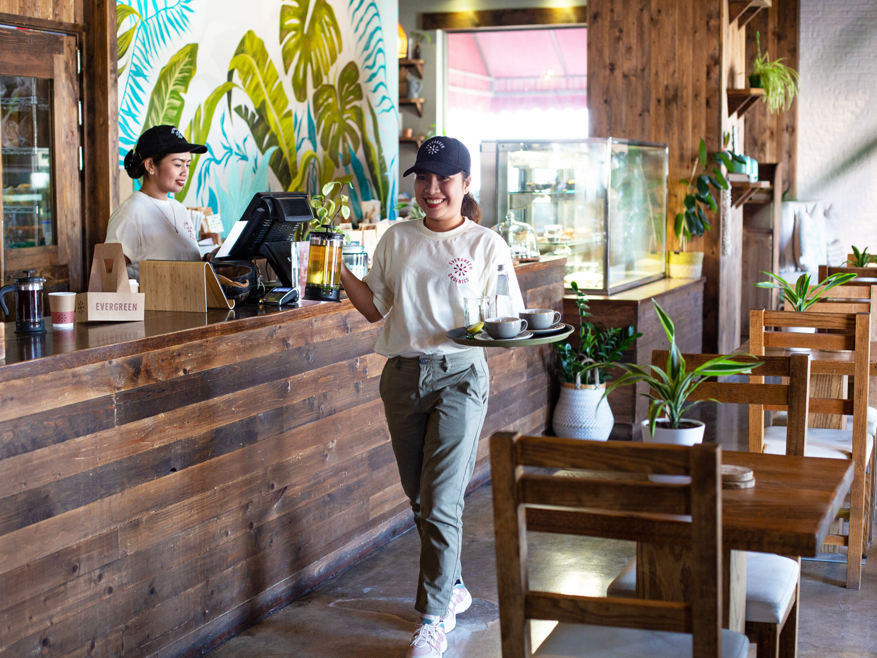
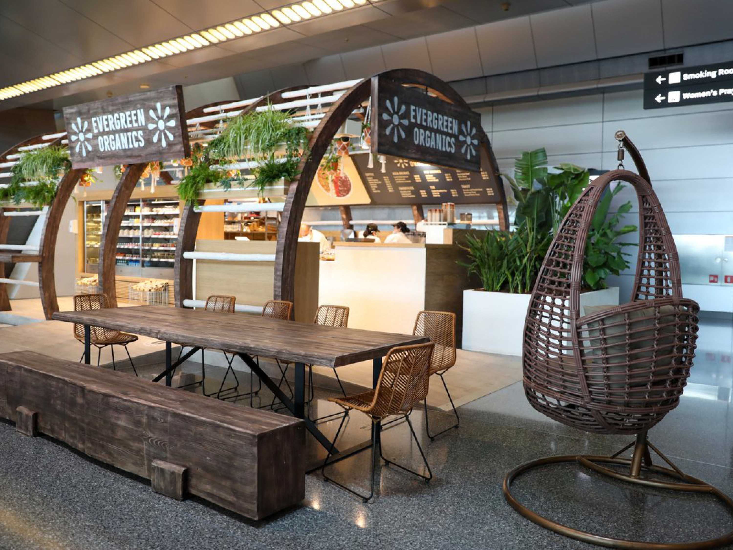
What may be considered a subtle re-brand exercise should not be underestimated. Evergreen had only one location before engaging with us; today, in 2022, the new brand has enabled the founders to add two more spots: Hamad International Airport and The Gate Mall, West Bay. Cohesively looking at the re-brand, these minor adjustments allowed the brand to have longevity and a future vision and made the overall experience more vibrant and mature. From the photography to the uniforms, the packaging to the website, the brand looks and acts more confident.
They are now firmly positioned as the first vegan restaurant in Qatar, and Evergreen’s new brand reflects their institutional values. Through our consultancy and strategic advisory, we helped evergreen position each cafe to have its only style and vibe, reminiscent of the different types of jungles you find worldwide. While working with Evergreen, we also helped them deploy healthy detox kits to people staying in quarantine during the COVID-19 pandemic.